
By Ryan Divish / The Seattle Times
The anticipation and excitement for the announcement was certainly dulled if not destroyed. The buildup to the official release and what the Seattle Mariners marketing machine could’ve done via social media throughout this week would’ve been interesting.
After patiently waiting for their turn in MLB’s order of importance and working on the project for more than two years, the Mariners unveiled their “City Connect” uniforms on Friday morning.
Of course, pictures of the jersey and socks had already leaked on Twitter a week ago, much to the disappointment of the Mariners.
But the cap and the pants were not part of the leak.
So there was some still level of surprise for fans.
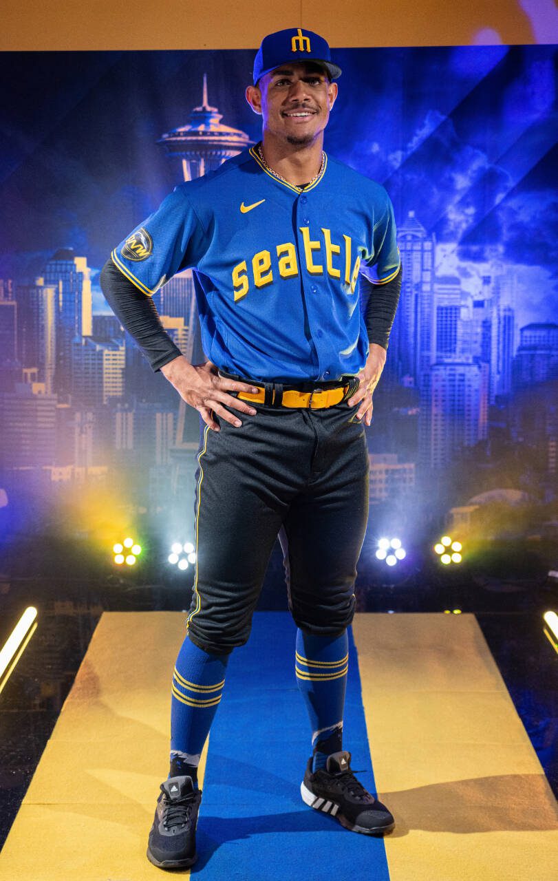
The theme for the Mariners’ City Connect uniforms “Past Presents Future.”
“What we tried to do was to make it a celebration of Pacific Northwest baseball,” said Kevin Martinez, senior vice president of marketing and communications. “With our team and that youthful energy, we wanted to present this uniform in a bold way. And the blue and the combination of the black is what we felt was the way to accomplish that boldness so in working with Nike they helped us develop these colors — rush blue, the sundown (yellow), Amarillo (gold) and black. The blues and the golds are certainly evocative of the Mariners and the Seattle Pilots. The black is from the Seattle Steelheads of the 1940s that color in their uniform and then just presenting them all together.”
This process was two years in the making.
“We started in the beginning of 2021,” Martinez said. “We sat down with Nike, and really tried to communicate the personality of our team. We had this exciting young team. And we came at it from the point of baseball storytelling in our city.”
When the Mariners started this process, only a handful of teams had debuted City Connect uniforms.
“Everybody took a different path, which is cool, which is a fun part of this program,” Martinez said. “The first effort, in talking with Nike, we leaned into, ‘how do we how do we celebrate the past of baseball in a bold new way that matches the energy and dynamic nature of our organization and where we’re headed.’”
The Mariners went through “three or four” iterations of the uniforms.
“There were some different color schemes, some different fonts, those types of things,” he said. “The narrative was the same, but the treatments were different. And then we got to this really vibrant blue, it really caught our eye and then marrying it with the gold and the black. That’s where we just said, ‘OK, this is a really strong look. It’s a clean look.’”
The reaction of the Mariners players was somewhat mixed. Some were more traditionalist in certain aspects.
“We showed it to them during spring training, and they were mostly positive,” Martinez said.
Teoscar Hernandez said, “they are sick” and that he liked the different look. Julio Rodriguez called the uniforms “clean” and was excited to debut them, already planning different cleats to wear with them.
“He looks good in the uniform,” Martinez said.
Of course, Rodriguez would make a burlap sack look good on a baseball field.
The Mariners will wear the uniforms for Friday night home games this season.
The cap
This was a favorite among the players and is certain to be a popular selection for fans. The crown of the cap is the rush blue with a slim gold trident outlined in black. The bill is also jet black.
With an actual trident being incorporated in the home run celebration, there is some symmetry with the hat. There will be a section of fans displeased that the trident is pointed with tines down because it supposedly brings bad luck. Per Greek mythology, the trident which was the weapon of Poseidon, the god of the sea, brings good luck when the tines are facing upward and bad luck when the tines are pointed down.
The inverted trident was used in the Mariners original logo, including their caps, for the first decade of the franchise’s existence before being jettisoned.
They brought the logo back for their spring training and batting practice caps in 2017. After a rash of injuries that season and more injuries again in 2018, the Mariners stopped wearing them for batting practice during the regular season, and they were gone after that season.
The pants
These will be the most controversial and surprising look of the uniform. The pants are jet black with a yellow and blue piping on the side. The Mariners will wear a gold belt with those pants.
It’s certainly different from the white, gray or even cream pants the team has worn.
The players had a mixed reaction to the pants.
“When you go with a colored pant, it causes people to pause,” Martinez said. “Even some of the guys, were like, ‘OK, it’s a dark pant, but it’s the whole City Connect thing.’ It’s so different than a white pant or a gray pant.”
When told they looked like a rec league slowpitch team, Martinez laughed.
They didn’t want to follow the Dodgers and Rockies, who had solid colored uniforms. Los Angeles has blue tops and pants, while Colorado has green pants and tops.
“We did not want to do all blue,” Martinez said. “We’d be seeing teams come out with that look. When we saw the design for the black pant hook up, we just thought it was a very aggressive, bold look. That’s part of what we’re trying to communicate with this whole City Connect program is us going into the next era of Mariners baseball. With this team, we liked the boldness and the aggressiveness of the look.”
Players can wear the pants down or wear them high to show off the special socks.
The socks
The socks, which are made by Stance, are predominantly rush blue with two gold stripes with a black stripe inside of it. The trident logo outlined in black sits at midcalf and the bottom of the sock features a salute to Mount Rainier.
The jerseys
The button up royal blue tops feature yellow and black piping on the cuffs of the sleeves and around the neck. Instead of “Mariners” across the front, they have “Seattle” in a familiar font for local baseball fans, who remember the Seattle Pilots.
“It’s not directly the old Pilots font, but it’s certainly evocative of the Pilots font,” Martinez said. “It was the first MLB team here and we give a cap tip to them with the font. A real cool element is that drop shadow on the font. If you remember the 1955 Pacific Coast League champion Seattle Rainiers, their uniforms and ‘55 had that black drop shadow to it. It was kind of fun element to include on the front of the jersey as we kept exploring the black.”
The jersey also features a patch on the right sleeve of the jersey with a highlight of Mount Rainier and the letters PNW for Pacific Northwest. There is also a shadow of the scrambled eggs designed in the patch from the old Seattle Pilots hats.
On the inside collar of the jersey is the slogan “Sodo Mojo” with two upward point tridents, which is a nod to where the Mariners have played in the Sodo District.
Just above the “jock tag” of the jersey on the lower right hip, where the jersey manufacturer leaves and official authentication, there is the phrase, “my oh my,” in gold letters, which is a tribute to the famous call of former broadcaster Dave Niehaus.
Talk to us
> Give us your news tips.
> Send us a letter to the editor.
> More Herald contact information.

